Hundreds of Design Elements
Tailor the design of your digital product experiences with our constantly growing library of design elements.
Tailor the design of your digital product experiences with our constantly growing library of design elements.

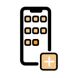
Add to Home Screen
Experience Navigation
Interaction
Prompt users to save your app to the homescreen from any page in your app.
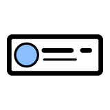
Avatar
Image
Displays a single image as a circle or square with rounded corners.
Avatar Carousel
Image
Interaction
Creates a carousel of avatar images in your app to use as app navigation, displaying photos of team members or event speakers, or featuring your products.
Banner
Displays alerts and appears on top of a page in your app and must be dismissed a user.
Blank
Place extra space in your app design.
Button: Clear
Experience Navigation
Interaction
An action button with a transparent background used to link to pages in your app or external links.
Button: Outline
Experience Navigation
Interaction
An action button with a transparent background and a solid border used to link to pages in your app or external links.
Button: Solid
Experience Navigation
Interaction
An action button with a solid background color used to link to pages in your app or external links.
Card Carousel
Image
Displays image, headline, and subheadline and allows app users to swipe the carousel.
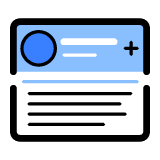
Card: Avatar
Image
Displays a circular image with a headline and subheadline.
Card: Expandable
Image
Displays a card that can expand and collapse to show more information such as FAQs.
Card: Expanded Avatar
Image
Displays a card with a circular image with a headline, subheadline, and body copy.
Card: Image
Image
Displays a headline and subheadline over an image.
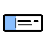
Card: Square Avatar
Image
Displays a square image on the left with a headline and subheadline on the right.
Card: Standard
Image
Displays an image with a headline, subheadline, and body copy below the image.
Card: Text Only
Text
Displays a headline, subheadline, and body copy within the card.
Checklist
Interaction
Displays a checklist item in your app that a user can check off once the action is completed.
Collapsible Menu
Experience Navigation
Appears as a vertical accordion menu displaying sections for navigation to app pages or external links.
Dropdown Navigation
Experience Navigation
Appears as a dropdown list displaying sections for navigation to app pages or external links.
Fab: Multiple
Fab
Interaction
Display a unique icon for up to five items in the expanded view of the floating action button.
Fab: Single
Fab
Interaction
Appears as one major call-to-action app users need to take.
Fab: Social
Fab
Social Media
Automatically pulls in icons for Facebook, Twitter, LinkedIn, and Instagram in a floating action button.
Flashcard: Image
Image
Displays a flashcard with an image with overlay text on the front side of the card and text only on the back.
Flashcard: Standard
Image
Displays a standard flashcard with text and image on the front side of the card and text only on the back.
Flashcard: Text
Text
Displays a flashcard with text on the front side of the card and text only on the back.
iframe Embed
Allows you to include countless integrations in an app using iframe embed code.
Image
Image
Enables you to upload an image to display on any page in your app.
Interactive Image
Image
Interaction
Displays an image with interaction points that dynamically update with related content when clicked.
Interactive Map
Image
Interaction
Display a map with interaction points that dynamically update with related content when clicked
Kaltura
Video
Integrates with Kaltura to embed videos in your app.
Line
Easily add a decorative line to your app design.
Markdown Text
Text
Displays content in an app through the Markdown syntax and supports HTML.
Popup Navigation
Experience Navigation
Interaction
Appears as a popup displaying a list for navigation to app pages or external links.
Rating Survey
Data
Survey
Interaction
Displays a rating survey to capture user satisfaction
Rich Text
Text
Displays formatted text using a WYSIWYG editor.
Section Header
Text
Displays a section header designed to organize text in your app.
Side by Side Card
Image
Place text next to an image in this card and swap the image to appear on the left or right, as well as format the text style, alignment, and font size.
Simple Survey
Data
Survey
Displays a survey for users to provide feedback and captures responses in the Data Store
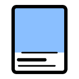
Slide: Content
Image
Displays a full page carousel with a headline, subheadline, and body copy on top of the image.
Slide: Expanded Content
Image
Displays full page slide carousel with an image, headline, subheadline, and body copy.
Slide: Expanded Content with Button
Image
Displays full page slide carousel with an image, headline, subheadline, body copy, and button.
Slide: Headline
Image
Displays full page slide carousel with an image and headline.
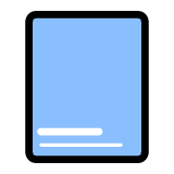
Slide: Image
Image
Displays full page slide carousel with an image.
Swiper Cover Flow Carousel
Image
Interaction
Displays up to 10 images that your app users can swipe through and has the option to link to an existing app page or external link.
Swiper Image Carousel
Image
Interaction
Displays up to 10 images with text overlay that your app users can swipe through and has the option to link to an existing app page or external link.
Tabbed Content
Experience Navigation
Interaction
Display up to three tabs with unique content including the option to include an image.
Toast
Messaging
Interaction
Displays a pop-up alerting app users to important information.
Two Icon Button
Experience Navigation
Interaction
Displays two icons in a button.
Vimeo
Video
Integrates with Vimeo to embed videos in your app.