How to Optimize Your Mobile Commerce Experience

by Katie Huston | Last Updated: Mar 14, 2019
by Katie Huston | Last Updated: Mar 14, 2019
Remember the excitement of the mobile commerce boom? You could now order anything, anytime from your smartphone and get it delivered right to your doorstep! Mobile commerce and ecommerce changed the way we shopped and revolutionized retail strategy. Mobile sales have steadily risen for the past several years, up past $117 billion in 2018, and by 2021, mobile ecommerce sales are estimated to account for more than 50 percent of all ecommerce shopping. Although more people are shopping through mobile now than ever, many retailers are seeing big drop-off rates for their mobile shoppers. What's the big issue that they're seeing? Namely, a lack of mobile-first optimization.
Without prioritization of mobile in web design, customers are having issues navigating sites and loading pages quickly. And since mobile-first design is an afterthought for many sites, these underperforming sites are creating far higher bounce rates for customers. An estimated 40 percent of users will go to a competitor after a bad mobile shopping experience. But luckily, there’s a few ways you can optimize your mobile commerce site to make sure you’re keeping your shoppers happily tapping that “Checkout” button and coming back for more.
Your Mobile Commerce Toolkit
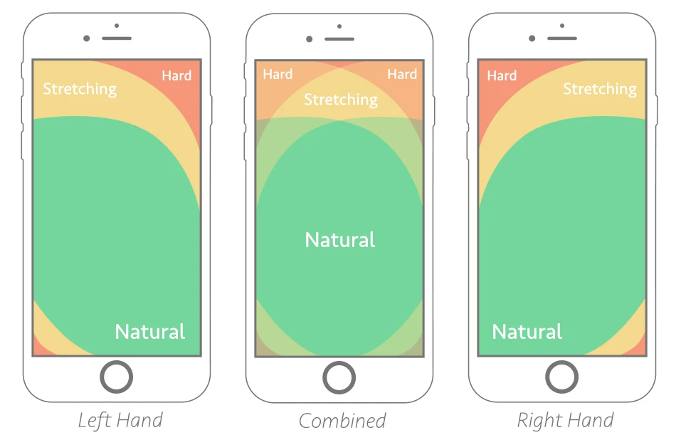
Make It Responsive You should be using responsive design so that your site changes content dynamically to suit the size of the screen that the user is on, whether it's an iPhone 5 or a desktop computer. If it’s not responsive and your site is difficult to navigate on mobile, you could be losing up to 61 percent of your visitors. Responsively designing for mobile should include a few big items: feature a navigation bar that pops down for ease of flipping through different categories and search functionality. Keeping these items within the "thumb zone" or the closest areas at the bottom left and right of the screen allows for more natural movement through the website and easier clicks.
Simplify, Simplify First thing’s first–your website needs to be fast. Use plugins sparingly and simplify your web design so there’s not so many complicated (read: slowing) components. Too much clutter on your pages with pop-ups and confusing design can throw off the customer and the simplicity keeps the design looking clean and consumable. It’s a double win because the more simple the website, the easier it is for consumers to navigate on mobile, therefore reducing drop off rates.
Speed It Up Did you know that the majority of mobile shoppers will abandon a page if it takes more than three seconds to load? You need to ensure that your shopper can get from product to cart to checkout at lightning speeds, or else you just might lose them. Think about building your mobile commerce site as a Progressive Web App, or an AMP for the speediest mobile experience possible. Improving your web server software can help speed up your load times as well as making sure that above-the-fold content loads before below-the-fold content. Tweaking your pages to adhere to these quick mobile tests can improve your load times and keep those customers on the page.
It's 2019 and there's no reason why your website shouldn't be optimized for mobile. Getting started with these few tips can help you in the long-run and improve your customer's experience with your brand, creating brand loyalty and bringing them back again and again.